
When the large amount of information behind quality research is transformed into a story, the story needs to be complemented with high quality design to ensure it is optimized for client engagement.
Visualizing data in quantitative research gets a lot of attention in the insight industry. But communicating qualitative insight requires the same level of attention to visual communication and design. It just comes in the form of (a lot of) words and verbatim, which need to be organized and structured into a well-designed visual representation in order to make an impact. From visualizing direct consumer quotes to Word Clouds, the design skills behind communicating qualitative research should be pushed.
Although PowerPoint is a common tool for creating insights reports, it is ultimately a design software, and this means that whoever uses it effectively becomes a designer. So, here are some design principles that you need to know in order to keep your insight presentation or report clear, professional and engaging.
Hierarchy
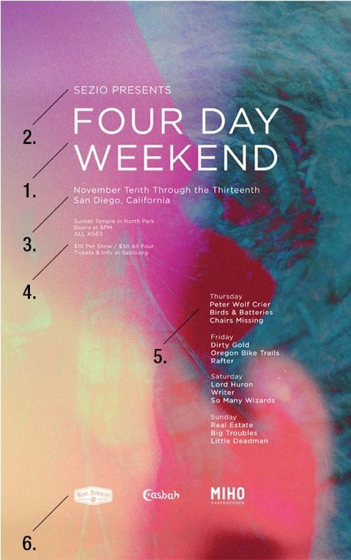
Designers use different design elements to curate the viewer’s experience carefully. Hierarchy is the order in which the viewer sees each aspect of the design, so the eye’s path can be controlled by factors such as size, color and positioning. This allows the viewer to see the most important information, for example the title, or the key insight from your study, before anything else. The event flyer below shows how the design works to draw the viewer’s eye from one event detail to the next.
Alignment
Imagine driving into a parking lot and finding that all the white lines indicating parking spaces had been removed. How would you know how to navigate the mess of parked cars to find your own space? The white lines turn the parking lot into a grid system, which creates a simple and effective experience for us. Our clients desire this same simple experience when viewing a qualitative research report. Alignment guides the positioning of shapes, charts and text according to straight lines, in a grid system, making it visually appealing to the audience, and easier for the client to see the key insights upfront. However, these straight lines don’t necessarily have to be at right angles – just make sure you are consistent with the angles of all features of the design.
Balance
The way you position and use elements of the design, such as text, images and color, affects the balance of the page or slide overall. For a clear and aesthetically pleasing design, the design of both sides of the page need to be equal, although this can be done both symmetrically and asymmetrically. A symmetrical balance is when both sides match identically across a center line, while an asymmetrical design is when the sides contain different design aspects but ultimately each side has the same weight (as shown below). For asymmetrical designs you might want to consider an object’s size, how close it is to the design’s center line, and use of texture and color to create the illusion of balance.

Contrast
Clever use of color will help to highlight important aspects of the design that you want to stand out and make an impact, like a powerful quote from a consumer. Using contrasting shades (e.g. yellow and blue) will catch the audience’s eye, while using more complementary or similar tones (e.g. two different shades of blue) will be less noticeable. In qualitative research this could be useful for insight boxes or quotes that you want to catch your client’s eye immediately.
These simple design tips work together with several other principles – such as white space (to make your insight easier to digest) and proximity (to help your audience understand relationships) – to help qualitative researchers visualize their research.
While qualitative research may not require the design of statistical charts like in quantitative research, communicating qual still requires a high standard of design outputs to keep clients engaged. Making sure your presentations and reports are consistent and aesthetically pleasing, and simple and easy to navigate, will help your insights communication hold maximum engagement and really make an impact.
If you want to know more about the techniques behind successfully delivering your insight to clients, from the art of storytelling to the technology to power it, check out our white paper on insight communications here.